Data Literacy Notes – Class 11 AI (843) | Must Know Points
Here are comprehensive, well-structured, and curriculum-aligned study notes for Data Literacy for Class 11 AI(843). This Data Literacy Notes of class 11 are specially designed according to the CBSE syllabus requirements and include clear theoretical explanations, real-world examples, important concepts, and key examination terminology for better understanding and effective exam preparation.
Data Literacy
- Data is a representation of facts or instructions about any entity (like students, school, business, animals, etc.) that can be processed by humans or machines.
- Data Literacy is the ability to find, understand, and use data effectively. It includes skills such as:
- Collecting data
- Organizing data
- Checking data quality
- Analyzing data
- Interpreting results
- Using data ethically
- Data can be of three types:
- Structured data
- Semi-structured data
- Unstructured data
Data Collection
- Data collection is the process of gathering information from different sources to study past events and find patterns.
- These patterns are used to build predictive models that help in forecasting future outcomes using machine learning.
- There are two main sources of data collection:
- Primary data (collected directly by the user or researcher)
- Secondary data (collected from existing sources like websites, reports, databases)
| Primary Data | ||
| Method | Description | Example |
| Survey | Collecting data from many people using forms or interviews to know opinions or behavior. | A questionnaire to find customer preferences for a product. |
| Interview | Direct conversation to collect detailed information from individuals or groups. | Taking employee feedback about job satisfaction. |
| Observation | Watching and recording behavior without interacting. | Observing how children play in a schoolyard. |
| Experiment | Changing variables to see their effect and find cause-effect results. | Testing which ad campaign gets more customer response. |
| Marketing Campaign (data-based) | Using customer data to improve and personalize marketing. | Sending personalized emails based on past purchases. |
| Questionnaire | A set of written questions to collect answers from people. | Rating satisfaction from 1 to 5 with feedback questions. |
| Secondary Data | ||
| Method | Description | Example |
| Social Media Data Tracking | Collecting data from posts, comments, and user interactions on social media. | Analyzing user reactions to a new product launch. |
| Web Scraping | Using tools to automatically extract data from websites. | Collecting product prices from e-commerce sites for comparison. |
| Satellite Data Tracking | Using satellite images to collect information about Earth and environment. | Monitoring weather changes using satellite images. |
| Online Data Platforms | Websites that provide ready-made datasets for analysis. | Using datasets from Kaggle or GitHub. |
Exploring Data
- Exploring data means understanding the data before analysis by studying its values and patterns.
- This step ensures that the data is clean and reliable for analysis.
Levels of Measurement
- Data is classified based on how it is measured, called the level of measurement.
- Data is not all the same; it can be of different types:
- Qualitative data (descriptive data)
- Nominal Data (names, labels)
- Ordinal Data (ordered categories)
- Quantitative data (numerical data)
- Interval (no true zero, equal intervals)
- Ratio (has true zero, meaningful ratios)
- Qualitative data (descriptive data)
Nominal Level
- Nominal level is the simplest type of data measurement where data is used only as names or labels.
- It represents categories without any order, rank, or numerical meaning.
- Data at this level cannot be used for calculations.
- Examples include:
- Mobile brands like Samsung, Oppo, Motorola
- Seasons like winter, spring, summer, autumn
Ordinal Level
- Ordinal level is used for data that can be grouped and arranged in a meaningful order or rank.
- It shows order (high to low or low to high), but the exact difference between values cannot be measured.
- Examples include:
- Sports ranking: 4th place → 3rd place → 2nd place → 1st place
- Grades like A, B, C, D
Interval Level
- Interval level data has a fixed order and equal differences between values.
- The difference between two values can be measured and is meaningful.
- It does not have a true zero value, so zero does not mean “nothing”.
- It is similar to ordinal data, but more precise because differences can be calculated.
- A common example is temperature (Celsius and Fahrenheit).
Ratio Scale Level
- Ratio level data is similar to interval data but has a true zero value.
- A true zero means zero represents “nothing” of that quantity.
- It allows all mathematical operations: addition, subtraction, multiplication, and division.
- Examples include:
- Exam scores (0–100 marks)
- Weight of a person (0 kg means no weight)
Statistical Analysis of Data
Measure of Central Tendency
Central tendency” is stated as the summary of a dataset in a single value that represents the entire distribution of data domain (or dataset).
Statistical analysis in Python can be done using the statistics module. To use it, we first import the library:
import statistics
The statistics module provides important functions to analyze data: mean(), mode(), variance(), stdev()
Mean
- Mean is the average value of a set of data in statistics.
- It is calculated by dividing the sum of all values by the total number of values.
- It helps in understanding the central value of a dataset.
- Formula for mean:
- M = Σfx / n
- Where:
- M = Mean
- Σ = Sum of all values
- f = Frequency of each value
- x = Score or value
- n = Total number of observations
Median
The median is another measure of central tendency. It is positional value of the variables which divides the group into two equal parts, one part comprising all values greater than median and other part smaller than median.
Mode
- Mode is another important measure of central tendency of statistical series. It is the value which occurs most frequently in the data series.
- It represents the highest bar in a bar chart or histogram.
| Concept | Mean | Median | Mode |
| Best used when | Data is evenly spread with no extreme values | Data has very high or very low extreme values | Finding most frequent or popular value |
| Meaning | Average of all values | Middle value of ordered data | Most common value / peak in data |
| Use case | General average calculation | Best for skewed data | Used for popularity or classification |
Variance and Standard Deviation
- Variance and Standard Deviation are measures of dispersion (spread of data).
- They show how data values are spread around the central value.
- Measures of central tendency (mean, median, mode) give the central value of the dataset.
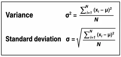
Important Facts about Variance and Standard Deviation
- A small variance means data values are close to the mean and to each other.
- A high variance means data values are widely spread from the mean and from each other.
- A low standard deviation means data values are closely grouped around the mean.
- A high standard deviation means data values are spread over a large range.
Representation of Data
- Statistics deals with collecting, organizing, analyzing, interpreting, and presenting data.
- Data representation helps in summarizing large data in a simple and meaningful format.
- It allows us to understand data easily without checking every single value.
- The main goal is to present data in a way that is quick and easy to interpret.
Types of Data Representation
- Non-Graphical Technique:
- Uses tables or case form to present data
- Not suitable for large datasets
- Difficult for decision-making in complex data
- Graphical Technique (Data Visualization):
- Represents data using graphs, charts, and diagrams
- Easier to understand large and complex data
- Helps in quick decision-making
Common Graphical Methods
- Line Graphs
- Bar Charts
- Pie Charts
- Scatter Plots
- Histograms
Data Visualization in Python
- Matplotlib is a Python library used for data visualization.
- It helps create different types of graphs like line plots, bar charts, histograms, and scatter plots.
- It is highly customizable, allowing control over colors, labels, and styles of graphs.
- pyplot is a submodule of Matplotlib that provides an easy interface for creating plots (similar to MATLAB).
- pyplot also includes simple functions to quickly create graphs.
Installing Matplotlib
- Using pip:
- pip install matplotlib
Or - python -m pip install -U matplotlib
- pip install matplotlib
Importing in Python
import matplotlib.pyplot
common Matplotlib Functions
| Function Name | Description |
| title() | Adds title to the graph |
| xlabel() | Sets label for X-axis |
| ylabel() | Sets label for Y-axis |
| xlim() | Sets range (limit) for X-axis |
| ylim() | Sets range (limit) for Y-axis |
| xticks() | Sets tick marks on X-axis |
| yticks() | Sets tick marks on Y-axis |
| show() | Displays the graph on screen |
| savefig() | Saves the graph to a specified file path |
| figure(figsize=()) | Sets the size of the graph window |
Line Graph
- A line graph is used to show continuous data on a numbered axis.
- It helps in understanding trends and changes over time.
- Data points are connected using a line, making patterns easy to see.
- It is useful for showing increase or decrease in data.
- Line chart is plotted in Python using the plot() function.
- Colour of the line can be specified using colour codes inside the plot() function.
Attributes of plot() function:
- linewidth → sets the thickness of the line
- linestyle → determines the style of line (solid, dashed, dotted, dashdot)
- marker → defines the shape of data points
- markersize → sets the size of markers
- markeredgecolor → sets the border colour of markers
Bar Graph
A bar graph is used to represent categorical data using rectangular bars. The height or length of each bar represents the value of the category.
It is useful for comparing values between different groups or categories. The relative size of bars makes comparison easy and clear.
A bar chart is created in Python using the bar() function.
Attributes of bar() Function:
- color → sets the color of the bars
- edgecolor → sets the color of the bar borders
- width → sets the width of the bars
Histogram
- A histogram is a graphical representation of data distribution.
- It uses vertical bars (rectangles) to show the frequency of data in different ranges.
- It is used to understand how data is spread and distributed.
Scatter Chart
A scatter plot is used to represent the relationship between two variables by plotting data points on the X and Y axes.
It helps in identifying correlation patterns such as positive or negative relationships, clusters, and trends.
Pie Chart
- A pie chart is a circular graph divided into slices (segments).
- Each slice shows a part or percentage of the whole data.
- It is useful for showing composition or proportion of data, not trends over time.
- Pie charts can be difficult to compare with other charts when data becomes complex.
Introduction to Matrix
- A matrix is a rectangular arrangement of numbers organized in rows and columns.
- Matrices are an important tool in mathematics and are widely used in computer vision and AI.
- In AI, images are represented using pixels, which are stored in the form of matrices.
Applications of Matrices in AI
- Matrices are widely used in Machine Learning and Artificial Intelligence for computation and data representation.
- Image Processing: Digital images are represented using matrices of pixel values. Each pixel has a numerical value showing its intensity (0 to 255).
- Recommender Systems: Matrices help relate users and products (viewed or purchased). Example: Netflix or Amazon recommendations.
- Natural Language Processing (NLP): Words are represented using vectors (1D matrices). Helps in analyzing word patterns in documents.
Data Preprocessing
- Data preprocessing is the process of cleaning and preparing data for machine learning.
- It makes data accurate, consistent, and suitable for models.
Data Cleaning
- Missing Data: Fill, delete, or estimate missing values.
- Outliers: Remove or adjust unusual data points.
- Inconsistent Data: Fix errors and format issues.
- Duplicate Data: Remove repeated entries.
Data Transformation
- Convert categorical data into numerical form.
- Modify or create new features if required.
Data Reduction
- Reduce dataset size by selecting important features.
- Use sampling or dimensionality reduction for large datasets.
Data Integration & Normalization
- Combine data from multiple sources.
- Normalize data so all values are on a similar scale.
Feature Selection
- Select only the most useful features for prediction.
- Remove irrelevant data.
Data in Modelling & Evaluation
- After data preprocessing, the dataset is divided into training data and testing data.
- The training data is used to train the machine learning model, while the testing data is used to check the model’s performance.
- Suitable machine learning algorithms are selected based on the problem type such as classification, regression, or clustering.
- Techniques like train-test split, cross-validation, and error analysis are used to evaluate how well the model performs and to improve it.